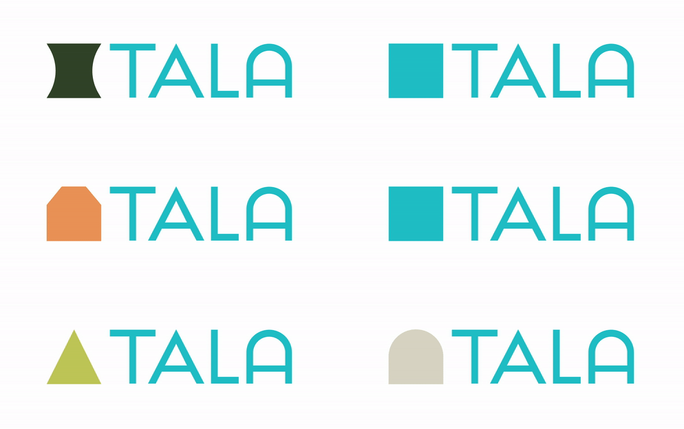
You’ve probably noticed we look different. It was about time.
Tala has evolved greatly since launching our first product. More than five million customers around the world have used Tala loans to start and grow small businesses and pursue financial goals with confidence. We’re always learning from our customers and are working hard to build new products to help you borrow and grow. As we evolve and introduce more financial tools, our look needs to expand with our product.
So today, we’re excited to reveal a visual evolution that celebrates what we’re becoming and the values that have helped make Tala one of the most trusted brands in the Philippines.

New logo. Tala has a new text-only logo (the Tala wordmark), featuring two distinct letter A’s, representing our values of diversity and inclusion. Most excitingly, our new text-only logo will shortly become the mobile app icon on your phone home screen. Yes, it’s true – it’s time to say farewell to our trusty blue circle icon and hello to a new, easy-to-recognize mark.

Bold new shapes. Our company mission remains focused on enabling and accelerating financial access. You will now see a bold range of geometric shapes, representing the arches, doorways, and windows we see, talk, and walk through together, everyday.
Peace of mind. Tala prides itself on being secure and trusted, and our cool and inviting teal primary brand color has played a big role in establishing this cornerstone with our customers. And now we want to tell even more of our story! So today we’re introducing a range of secondary colors that give us a new rich vibrant palette to further highlight stories of diversity across customer messaging and product offering.
At Tala, we strive to take a friendly, honest, and transparent approach to serve you as a trusted financial partner. With Tala, we hope that you can find a community and financial home – symbolism you may notice has also been carried through in our new brand shapes.
Let’s grow together.
